“Pope Francis shocks world, endorses Donald Trump for president” – 2016 Headline
During the 2016 Presidential campaigns, this headline gathered approximately 960,000 Facebook engagements1. Of course, it wasn’t the only “fake news” headline or story making rounds through social media, private messages, and even legit news sources during this time.
While the idea of fake news – or misinformation/disinformation – isn’t anything new (for example, during the election of 1800, Thomas Jefferson was reported to be dead – for the record, Jefferson didn’t die until 1826), it is now more accessible than it was during the birth of our nation. An increase in literacy aside, with current technology and social media, we are inundated with news – both real and “fake.”
Patent attorney, Vanessa Otero, became concerned with the quality of articles she saw circulating through her social media feeds as individuals attempted to support their opinions. She noted that friends, family, and associates were sharing bias reports, false claims, and misleading information.
“I thought it might be helpful to just kind of map [the different news sources] – like better, worse, left and right – so I just started piecing it together on my own, just to explain to my friends.”2
Thus, the media bias chart was created!!
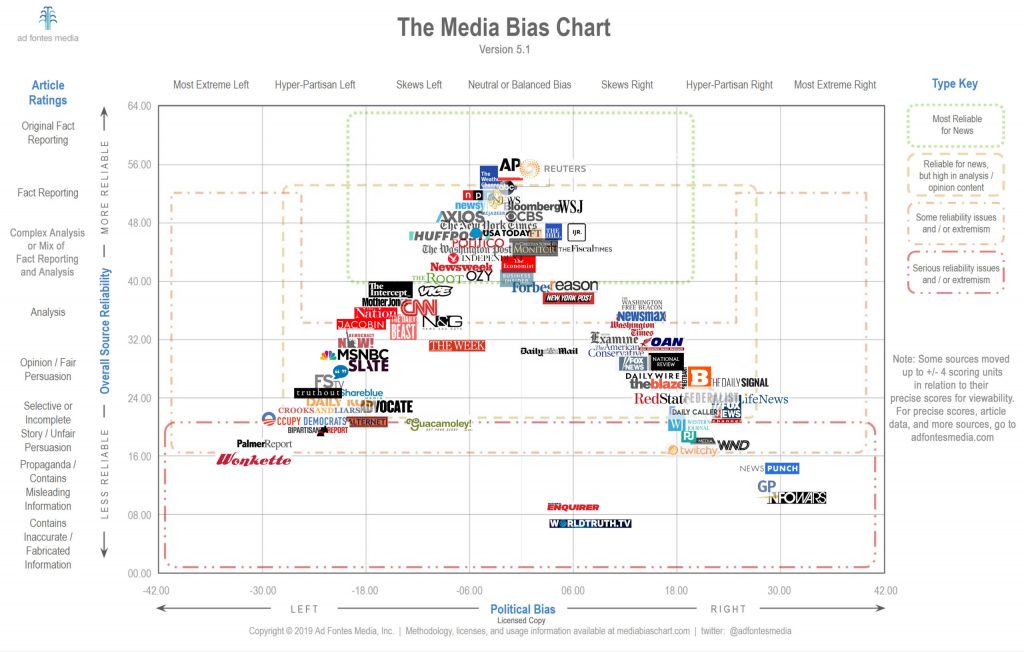
“If people understood that the sources they’re consuming are actively making them angrier and polarizing them, then they might choose to consume less of that,” Otero remarked.
During this ongoing pandemic, I have found myself using this chart more often as I wade through the pool of news. My friends and family have mixed opinions about this whole situation, so they’ve shared a wide variety of news references to present their opinions. If someone shares something from The Daily Beast or The Washington Times, I may be a little more skeptical than if they shared something from NPR – purely due to the bias lean of the aforementioned sources.
Topics like COVID-19, the presidential election, and local attacks on the Naval Air Station prompt us to seek information to better understand what’s happening around us – after all, it’s important to be informed. However, it means nothing unless we can guarantee the information we’re gathering is accurate. So, keep this media bias chart handy as you navigate the world of information at your fingertips. Hopefully, it will help you as you determine how much credibility a source deserves and whether or not something is worth clicking that share button.
Happy News-Wading!!
Trisha